


Flutter's support on mobile, desktop and web brought a new challenge in our lives: Supporting different screen sizes and adapting our design.
Most of the time developers have tendency to think with the device that they own and build their applications accordingly. But there are different screen sizes, orientations, pixel densities on all the devices targeted. As a good developer, we should adapt your design accordingly.
Importance of this topic has got a lot of people's attention that, so many people started to create content and solutions about it. One of the solutions that got my attention was the adaptive material component libraries from Material Design team.
In this blog post, you will learn about using the adaptive material component libraries and how can it help you to achieve adaptive design without having a lot of effort.
A Bit History
You can skip and go to next section for implementation if you do not feel like reading some dude talking about his learning experience
Flutter developers have been relying on LayoutBuilder, MediaQuery.of, FractionallySizedBox, AspectRatio, Column, Flexible and many other widgets for a long time to achieve actual adaptive design with their applications. But they always had similar questions such as "What the hell is my breakpoint from a tablet to phone and back to the computer screen?". They looked for several different resources but they could not find a definitive answer. On one hand their designer might give them tips but on the other they would just ask themselves "Isn't there a better way to do this?"
Luckily, Flutter folks have heard and felt the questions and desperate attempt of the Flutter developers trying to achieve this thing, they wanted to help. They started to work on a library called flutter_adaptive_scaffold. This library handles the screen size changes, navigation and showing a proper portion of the application on the right time was actually a game changer library for the community.
While I was playing around with the library for my talk at the Flutter Vikings, I realized that flutter_adaptive_scaffold library was nice but it was too opinionated. If I needed to have only the sccren change listener, I could not have it because I was bound to their way of implementing UI. I still kept it in my talk to show folks how it works on Flutter applications but a part of me was longing for a better way.
During the time at the Flutter I was MC'ing several talks and I had a chance to see some great talks from great people. One of them was from from Anthony Robledo about google_fonts but what my attention was the adaptive material libraries that he mentioned. So I started to dig in and now you will see my findings out of it.
The Hero: adaptive_components
In my search for an easy to use adaptive design library, adaptive_components was the most straight-forward way to handle UI changes per different screen sizes. The library follows the Material Design Guideline for different screen sizes.
As of 15th of September, 2022, adaptive_components library has two solid components. One of them is AdaptiveContainer and the other one is AdaptiveColumn.
AdaptiveContainer is a specialized container to let you create a container with adaptive constraints. It uses a LayoutBuilder internally to check if the container is in the desired constraint. You can use AdaptiveContainer with multi child widgets such as Column, Stack etc.
AdaptiveColumn is a widget to keep children widgets and position them inside a Wrap widget with the constraint information retrieved by LayoutBuilder. AdaptiveColumn expexts AdaptiveContainers to be used as children because AdaptiveContainers have a columnSpan property to help laying the child elements out.
How to use AdaptiveContainer?
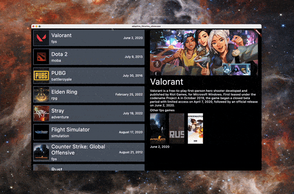
By using AdaptiveContainer you will be able to create the application above. The app will stretch the UI until a point and bring a detail view after a point without us defining any "breakpoints".
For using either AdaptiveContainer or AdaptiveColumn we need to add the adaptive_components library to our project. Open up your pubspec.yaml file and add the following under dependencies tag:
dependencies:
  flutter:
    sdk: flutter

  adaptive_components: ^0.0.7
After adding this call flutter pub get to download the libraries to your project. Once you have the projects, now it is time to use the library:
import 'package:adaptive_components/adaptive_components.dart';
import 'package:adaptive_libraries_showcase/game.dart';
import 'package:adaptive_libraries_showcase/game_detail.dart';
import 'package:adaptive_libraries_showcase/game_list.dart';
import 'package:adaptive_libraries_showcase/main_page_large.dart';
import 'package:flutter/material.dart';

void main() {
  runApp(const AdaptiveContainerExample());
}

class AdaptiveContainerExample extends StatefulWidget {
  const AdaptiveContainerExample({Key? key}) : super(key: key);

  @override
  State<AdaptiveContainerExample> createState() =>
      _AdaptiveContainerExampleState();
}

class _AdaptiveContainerExampleState extends State<AdaptiveContainerExample> {
  Game game = games.first;

  @override
  Widget build(BuildContext context) {
    return MaterialApp(
      home: Scaffold(
        backgroundColor: const Color(0xFF030403),
        // (1)
        body: Stack(
          children: [
            // (2)
            AdaptiveContainer(
              // (3)
              constraints: const AdaptiveConstraints(
                xsmall: false,
                small: false,
                medium: false,
                large: true,
                xlarge: true,
              ),
              child: Row(
                children: [
                  Expanded(
                    child: GameList(
                      games: games,
                      onGameSelected: (game) {
                        setState(() {
                          this.game = game;
                        });
                      },
                    ),
                  ),
                  Expanded(
                    child: GameDetail(game: game),
                  ),
                ],
              ),
            ),
            AdaptiveContainer(
              constraints: const AdaptiveConstraints(
                xsmall: true,
                small: true,
                medium: true,
                large: false,
                xlarge: false,
              ),
              child: GameList(
                games: games,
                onGameSelected: (game) {},
              ),
            ),
          ],
        ),
      ),
    );
  }
}
- (1) : Stack, Column etc. kind of widgets are used to have multiple child elements so when they are shown childrens which are visible can orchestrate their positioning
- (2)/(4) : All the AdaptiveContainers are used to create adaptive UI elements for certain screen sizes
- (3) : AdaptiveConstraints can be used to decide which constrants are applicable to the AdaptiveContainer. You can either call the regular constructor like above and combine different screen sizes or you can call named constructors such as
AdaptiveConstraints.small()to support one constraint type as well.
How to use AdaptiveColumn?
Using AdaptiveColumn is no rocket science. Whenever you are planning to use (like any other multi child widgets), you will add it to your code and add some child widgets in it.
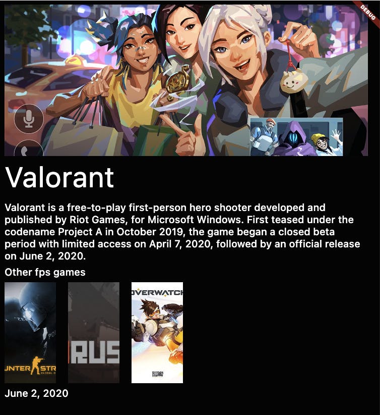
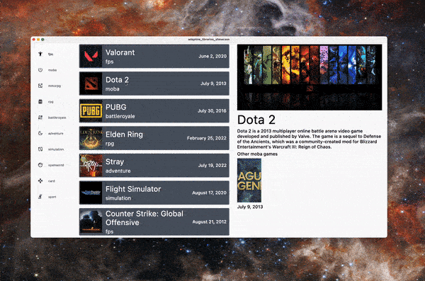
You might not realize that earlier (because you have not seen the source code yet), but with the game detail page we are actually using AdaptiveColumn to lay the child widgets out. In the UI above, you can see that some widgets are in the same "row" and some are drawn one after another. AdaptiveColumn and AdaptiveContainer combination actually helps us for achieving that.
import 'package:adaptive_components/adaptive_components.dart';
import 'package:adaptive_libraries_showcase/game.dart';
import 'package:adaptive_libraries_showcase/game_item_small.dart';
import 'package:flutter/material.dart';

class GameDetail extends StatelessWidget {
  const GameDetail({
    required this.game,
    Key? key,
  }) : super(key: key);

  final Game game;

  @override
  Widget build(BuildContext context) {
    final similarGames = games.where((element) =>
        element.category == game.category && element.name != game.name);
    return Padding(
      padding: const EdgeInsets.only(top: 8),
      // (1)
      child: Align(
        alignment: Alignment.topCenter,
        // (2)
        child: AdaptiveColumn(
          children: [
            // (3)
            AdaptiveContainer(
              // (4)
              columnSpan: 12,
              color: Colors.blue,
              child: Image.network(
                game.backdropImage,
                height: 300,
                fit: BoxFit.cover,
              ),
            ),
            AdaptiveContainer(
              columnSpan: 6,
              child: Text(
                game.name,
                style: Theme.of(context)
                    .textTheme
                    .headline2
                    ?.copyWith(color: Colors.white),
              ),
            ),
            AdaptiveContainer(
              columnSpan: 6,
              child: Text(
                game.description,
                style: Theme.of(context)
                    .textTheme
                    .headline6
                    ?.copyWith(color: Colors.white),
              ),
            ),
            AdaptiveContainer(
              columnSpan: 12,
              child: Text(
                'Other ${game.category.name} games',
                style: Theme.of(context)
                    .textTheme
                    .headline6
                    ?.copyWith(color: Colors.white),
              ),
            ),
            // (5)
            ...similarGames.map(
              (e) => AdaptiveContainer(
                columnSpan: 1,
                child: GameItemSmall(game: e),
              ),
            ),
            AdaptiveContainer(
              columnSpan: 12,
              child: Text(
                game.releaseDate,
                style: Theme.of(context)
                    .textTheme
                    .headline6
                    ?.copyWith(color: Colors.white),
              ),
            ),
          ],
        ),
      ),
    );
  }
}
- (1): Align widget helps us to position the widgets on any available part of the parent widget. Without using the Align the child widget is positioned at the center.
- (2): You can use AdaptiveColumn at any point of the widget tree. It will do the calculations according to the size that parent has before drawing child widgets.
- (3): Each child element of AdaptiveColumn should be an AdaptiveContainer.
- (4): AdaptiveContainer has a field called
columnSpan, it is default by one. The content is placed in the areas of the screen that contain columns. In responsive layouts, column width is defined with percentages, rather than fixed values. This allows content to adapt to any screen size. The number of columns displayed in the grid is determined by the breakpoint range, a range of predetermined screen sizes. A breakpoint can correspond with mobile, tablet, or other screen type. There can be at most 12 columns per flex range. For more information, check here. - (5): Spread operator(...) helps us to map data into widgets when we need it here. All the elements have a
columnSpanof 1 and that is why they are next to each other.
The navigator: adaptive_navigation
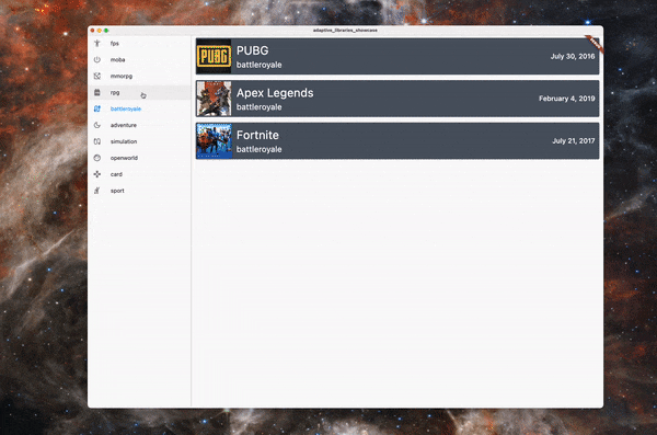
Material Design has a strong opinion about navigation. They use Drawer, NavigationRail or BottomNavigationBar according to the screen size with this package. Each navigation destination is pre-defined.
For using either AdaptiveNavigationScaffold we need to add the adaptive_navigation library to our project. Open up your pubspec.yaml file and add the following under dependencies tag:
dependencies:
  flutter:
    sdk: flutter

  adaptive_navigation: ^0.0.7
After adding this call flutter pub get to download the libraries to your project. Once you have the projects, now you can use the library in your project:
import 'package:adaptive_libraries_showcase/game.dart';
import 'package:adaptive_libraries_showcase/game_list.dart';
import 'package:adaptive_navigation/adaptive_navigation.dart';
import 'package:flutter/material.dart';

void main() {
  runApp(const MaterialApp(home: DefaultScaffoldDemo()));
}

class DefaultScaffoldDemo extends StatefulWidget {
  const DefaultScaffoldDemo({Key? key}) : super(key: key);

  @override
  State<DefaultScaffoldDemo> createState() => _DefaultScaffoldDemoState();
}

class _DefaultScaffoldDemoState extends State<DefaultScaffoldDemo> {
  int _selectedIndex = 0;

  @override
  Widget build(BuildContext context) {
    // (1)
    return AdaptiveNavigationScaffold(
      selectedIndex: _selectedIndex,
      // (2)
      bottomNavigationOverflow: 10,
      // (3)
      onDestinationSelected: (index) {
        setState(() {
          _selectedIndex = index;
        });
      },
      destinations: _getDestinations(),
      body: GameList(
        games: games
            .where(
              (element) => element.category == Category.values[_selectedIndex],
        )
            .toList(growable: false),
        onGameSelected: (value) {},
      ),
    );
  }

  List<AdaptiveScaffoldDestination> _getDestinations() {
    int index = -1;
    return Category.values.map(
          (e) {
        index++;
        // (4)
        return AdaptiveScaffoldDestination(
          title: e.name,
          icon: icons[index],
        );
      },
    ).toList(growable: false);
  }
}

const icons = [
  Icons.accessibility_new,
  Icons.power_settings_new_outlined,
  Icons.open_in_new_off_rounded,
  Icons.backpack,
  Icons.cable_outlined,
  Icons.dark_mode_outlined,
  Icons.earbuds,
  Icons.face_outlined,
  Icons.games,
  Icons.hail
];
- (1): AdaptiveNavigationScaffold is the default Scaffold to be used for implementing the library. It adapts to the screen size and shows the proper navigation element
- (2): You can decide on the elements that you have at your bottom navigation bar. The default value is 5. I picked 10 because there are 10 categories added.
- (3): Each time a navigation element is selected this callback will be called, you can select a value to be assigned to keep track of it
- (4): AdaptiveScaffoldDestination is the class to keep track of the destinations.
You can make the best out of its usage. You can either show a different UI per selected element or like I did, filter out any data that is irrelevant to the destination.
If you are not happy with the breakpoints of the navigator for selecting the navigation type, you can override the navigationTypeResolver property but IMO, it makes sense to stick to the library if you want an opinionated way of navigating.
The full package: flutter_adaptive_scaffold
As of 15th of September 2022, the package adaptive_scaffold renamed into flutter_adaptive_scaffold, because someone else already have gotten the name adaptive_scaffold. :)
But what is this AdaptiveScaffold and why should we use it? AdaptiveScaffold reacts to input from users, devices and screen elements and renders your Flutter application according to the Material 3 guidelines. It combines the navigation and component libraries with a fancy animation between components.
For using either AdaptiveScaffold we need to add the adaptive_navigation library to our project. Open up your pubspec.yaml file and add the following under dependencies tag:
dependencies:
  flutter:
    sdk: flutter

  flutter_adaptive_scaffold: ^0.0.3
After adding this call flutter pub get to download the libraries to your project. It is time to use the library:
import 'package:adaptive_libraries_showcase/game.dart';
import 'package:adaptive_libraries_showcase/game_detail.dart';
import 'package:adaptive_libraries_showcase/game_list.dart';
import 'package:adaptive_libraries_showcase/main_navigation.dart';
import 'package:flutter/material.dart';
import 'package:flutter_adaptive_scaffold/flutter_adaptive_scaffold.dart';

void main() {
  runApp(const _MyApp());
}

class _MyApp extends StatelessWidget {
  const _MyApp({Key? key}) : super(key: key);

  @override
  Widget build(BuildContext context) {
    return const MaterialApp(home: MyHomePage());
  }
}

class MyHomePage extends StatefulWidget {
  const MyHomePage({Key? key}) : super(key: key);

  @override
  State<MyHomePage> createState() => _MyHomePageState();
}

class _MyHomePageState extends State<MyHomePage> {
  int _selectedIndex = 0;
  Game game = games.first;

  @override
  Widget build(BuildContext context) {
    // (1)
    return BottomNavigationBarTheme(
      data: const BottomNavigationBarThemeData(
        unselectedItemColor: Colors.black,
        selectedItemColor: Colors.black,
        backgroundColor: Colors.white,
      ),
      // (2)
      child: AdaptiveScaffold(
        selectedIndex: _selectedIndex,
        onSelectedIndexChange: (index) {
          setState(() {
            _selectedIndex = index;
          });
        },
        useDrawer: false,
        // (3)
        destinations: _getDestinations(),
        // (4)
        body: (_) => Row(
          children: [
            Expanded(
              child: GameList(
                games: games,
                onGameSelected: (game) {
                  setState(() {
                    this.game = game;
                  });
                },
              ),
            ),
            Expanded(
              child: GameDetail(
                game: game,
                hasDarkText: true,
              ),
            ),
          ],
        ),
        // (5)
        smallBody: (_) => GameList(
          games: games
              .where(
                (element) =>
                    element.category == Category.values[_selectedIndex],
              )
              .toList(growable: false),
          onGameSelected: (value) {},
        ),
        // (6)
        // secondaryBody: AdaptiveScaffold.emptyBuilder,
        // (7)
        // smallSecondaryBody: AdaptiveScaffold.emptyBuilder,
      ),
    );
  }

  // (8)
  List<NavigationDestination> _getDestinations() {
    int index = -1;
    return Category.values.map(
      (e) {
        index++;
        return NavigationDestination(
          label: e.name,
          icon: Icon(icons[index]),
        );
      },
    ).toList(growable: false);
  }
}
Let's examine the code above now:
- (1):
BottomNavigationBarThemehelps us to define a theming system for the bottom navigation bar that is shown in the smaller screens. - (2):
AdaptiveScaffoldis a special Scaffold to use an opinionated way of handling the layout and navigation. It is the base of the library. - (3):
destinationsis the navigation elements to be used for generating navigation type. - (4): For every possible page the first body which "tried" be shown is
bodyproperty. - (5):
smallBodyis the page to be shown when the window constraints are bound to small or xsmall adaptive breakpoints. - (6)/(7):
secondaryBodyorsmallSecondaryBodyis to be displayed in the secondaryBody slot at the middle or small breakpoint respectively. e.g. When the Desktop width is too wide, the secondary body will come to display to give more information. - (8): Generate the navigation elements to keep track of destinations.
Conclusion
The point of this blog post is to give you a visibility over this amazing project going on behind the scenes. They have couple of problem that I found along the way but with more attention and usage I am sure it will come to a great place.
If you have any questions or comments leave it here or ask me over Twitter.